

The Devin Carver Team
SERVICE
Full Brand Identity & Custom Website
Welcome to The Devin Carver Team
From sand to sold.
Friendly, professional guidance for first-timers, beach homes, and investors.
Brokered by KW Innovate
Positioning Statement:
Topsail Island is home base and the heart of our brand. We deliver veteran‑owned, high‑touch service across Surf City, Topsail Beach, North Topsail, and Sneads Ferry—while proudly serving military families and VA buyers throughout the coastal Carolinas (Onslow & Pender counties and beyond within ~90 minutes of Jacksonville). We pair local insight with investor‑smart strategy so every move feels calm and clear.
“Topsail is home base for us. As a veteran, I move fast, give straightforward advice, and bring island-savvy, VA-friendly strategy—so whether you’re PCSing, buying a beach place, or investing, you can move with confidence across the coastal Carolinas.”
-Devin Carver

Comprehensive Brand Identity for The Devin Carver Team
Purpose:
To make coastal real estate clear, confident, and joyful at every price point—serving first‑time buyers, beach‑home owners, and investors with island‑savvy guidance, quick communication, and option‑based strategy.
Positioning Statement:
Topsail Island is home base and the heart of our brand. We deliver veteran‑owned, high‑touch service across Surf City, Topsail Beach, North Topsail, and Sneads Ferry—while proudly serving military families and VA buyers throughout the coastal Carolinas (Onslow & Pender counties and beyond within ~90 minutes of Jacksonville). We pair local insight with investor‑smart strategy so every move feels calm and clear.
Mission
Serve every client with luxury‑level care and straightforward advice—pairing coastal expertise with investor‑smart guidance so buying or selling at the coast feels confident and calm.
Vision
Be the trusted Topsail‑first team—known for swift communication, veteran‑friendly processes, and results that help clients live well and invest wisely across the coastal Carolinas.
Values
Trust · Clarity · Responsiveness · Local Insight · Education · Integrity · Stewardship · Joy · Service
Tagline (approved)
Trusted Guidance. Coastal Expertise.
Key Audiences
Military & VA buyers (≈60% of closings): base‑adjacent moves, PCS timelines, VA loan clarity
Coastal/second‑home buyers: island know‑how; insurance/flood nuances; rental potential
First‑time buyers: calm education; step‑by‑step tools
Investors/STR: cap rates, STR rules, compliance, management considerations
Psychographics:
First‑timers who want calm education
Each‑home buyers who want island know‑how
Investors who want clear numbers and rules
People who value friendly, professional, trustworthy guidance
How This Brand Speaks to Its Audience
Tone of Voice
Friendly, professional, and natural—straightforward advice over jargon. Define terms; show options and trade‑offs; lead with timelines. Confident and calm.
Use Often: island‑savvy, investor‑smart, VA‑friendly, options, next steps, same‑day alerts.
Audience Tuning:
Military/VA → lender readiness, BAH/PCS timing, appraisal/inspection clarity
Investors → numbers first; STR ordinances; insurance/flood basics
First‑timers → checklists, glossary, expectations
Sellers → pricing strategy, market data, communication rhythm
Voice & Tone
Friendly, professional, and natural—straightforward advice over jargon. Define terms; show options and trade‑offs; lead with timelines. Confident and calm.
Use Often: island‑savvy, investor‑smart, VA‑friendly, options, next steps, same‑day alerts.
Audience Tuning:Military/VA → lender readiness, BAH/PCS timing, appraisal/inspection clarity
Investors → numbers first; STR ordinances; insurance/flood basics
First‑timers → checklists, glossary, expectations
Sellers → pricing strategy, market data, communication rhythm
Messaging & Copy
Hero (choose 1)
A. Trusted Guidance. Coastal Expertise.
Proudly serving Topsail Island and our military families across the coastal Carolinas—with straightforward advice, fast answers, and island‑savvy strategy.B. Island‑Savvy. Straightforward Service.
Veteran‑owned. Topsail‑first focus, VA‑friendly processes, and a calm path from search to closing.C. Coast Smart. Live Well.
Every listing, same‑day alerts, and investor‑smart guidance—centered on Topsail Island and the communities we serve.Footer/Badge line
Veteran‑Owned & VA‑Savvy • Brokered by KW InnovateOne‑liner
Veteran‑owned, island‑savvy real estate—straightforward advice, fast replies, and investor‑smart strategy for Topsail Island and the coastal Carolinas.
About (short)
The Devin Carver Team delivers luxury‑level service at every price point. Topsail Island is our heartbeat, and we proudly serve military families and VA buyers across Onslow and Pender counties and beyond. With fast communication, clear options, and local know‑how, we make complex decisions feel simple—and every milestone feel calm.
Key Messaging Themes
Island‑Savvy Guidance — real local insight across Surf City, Topsail & Sneads Ferry.
VA‑Friendly & Veteran‑Owned — processes and partners who know the mission.
Investor‑Smart Strategy — cap rates, STR rules, flood/insurance basics—made clear.
Clarity & Options — straightforward advice and step‑by‑step plans.
Fast & Responsive — same‑day alerts, quick showings, proactive updates.
Luxury‑Level Service for Every Price Point — polished, professional, consistent.
Key Phrases (top 6)
Island‑savvy. Straightforward service.
Investor‑smart, VA‑friendly.
Clear options. Confident moves.
Fast answers. Same‑day alerts.
Luxury‑level service at every price point.
Buy, sell, invest with confidence.
Calls to Action (6)
Search Homes Now — see every Surf City/Topsail listing.
Get Same‑Day Alerts — new listings that match your criteria.
Schedule a Call — 15‑minute game plan for your goals.
VA Buyer Guide — eligibility, appraisal, and timelines made simple.
Investor Starter Kit — STR rules + cap‑rate cheat sheet.
Grab the Buyer/Seller Checklist — clear steps from offer to close.
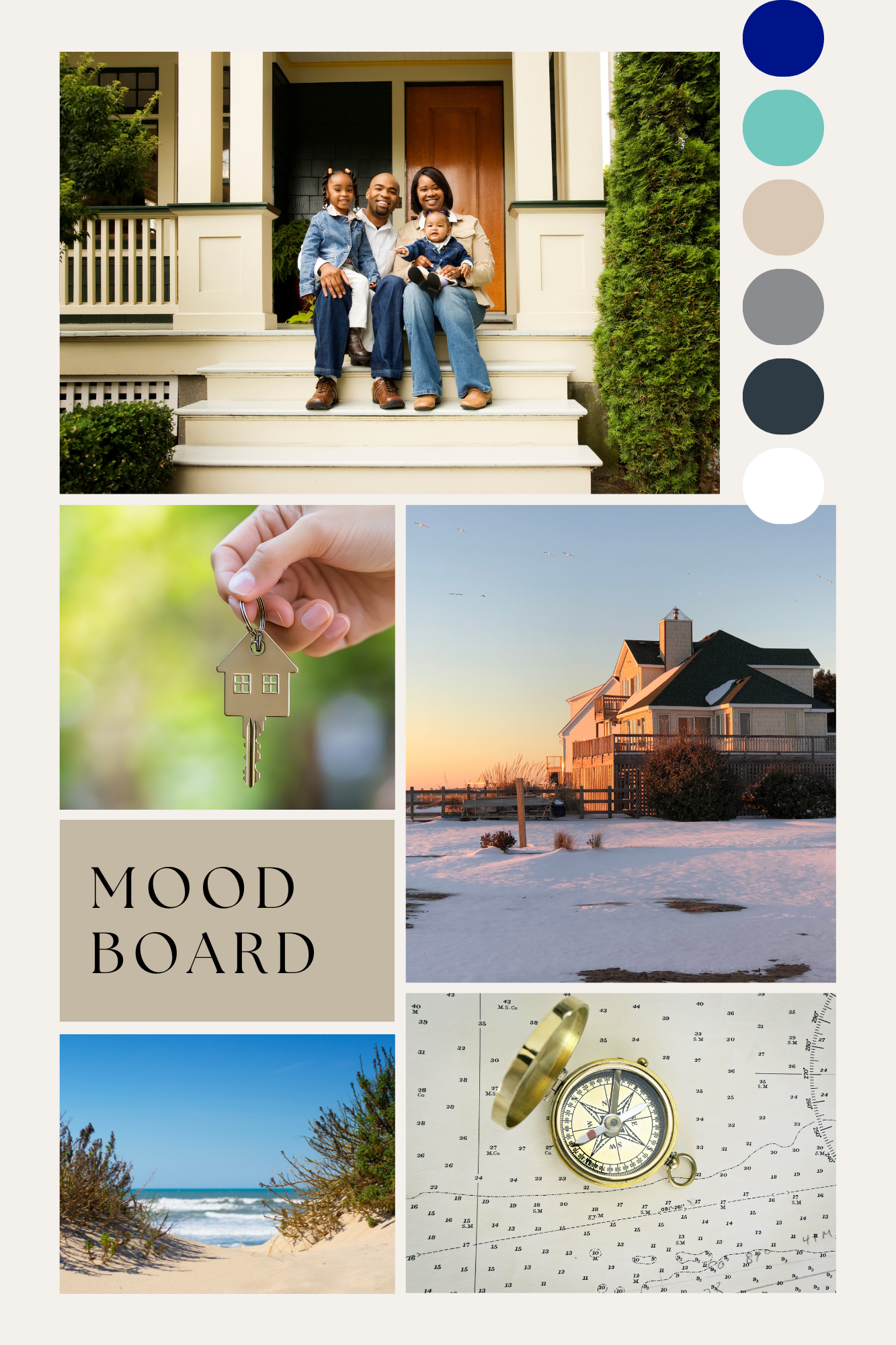
Brand Identity Journey - Moodboard & Brand Color Pallet Strategy
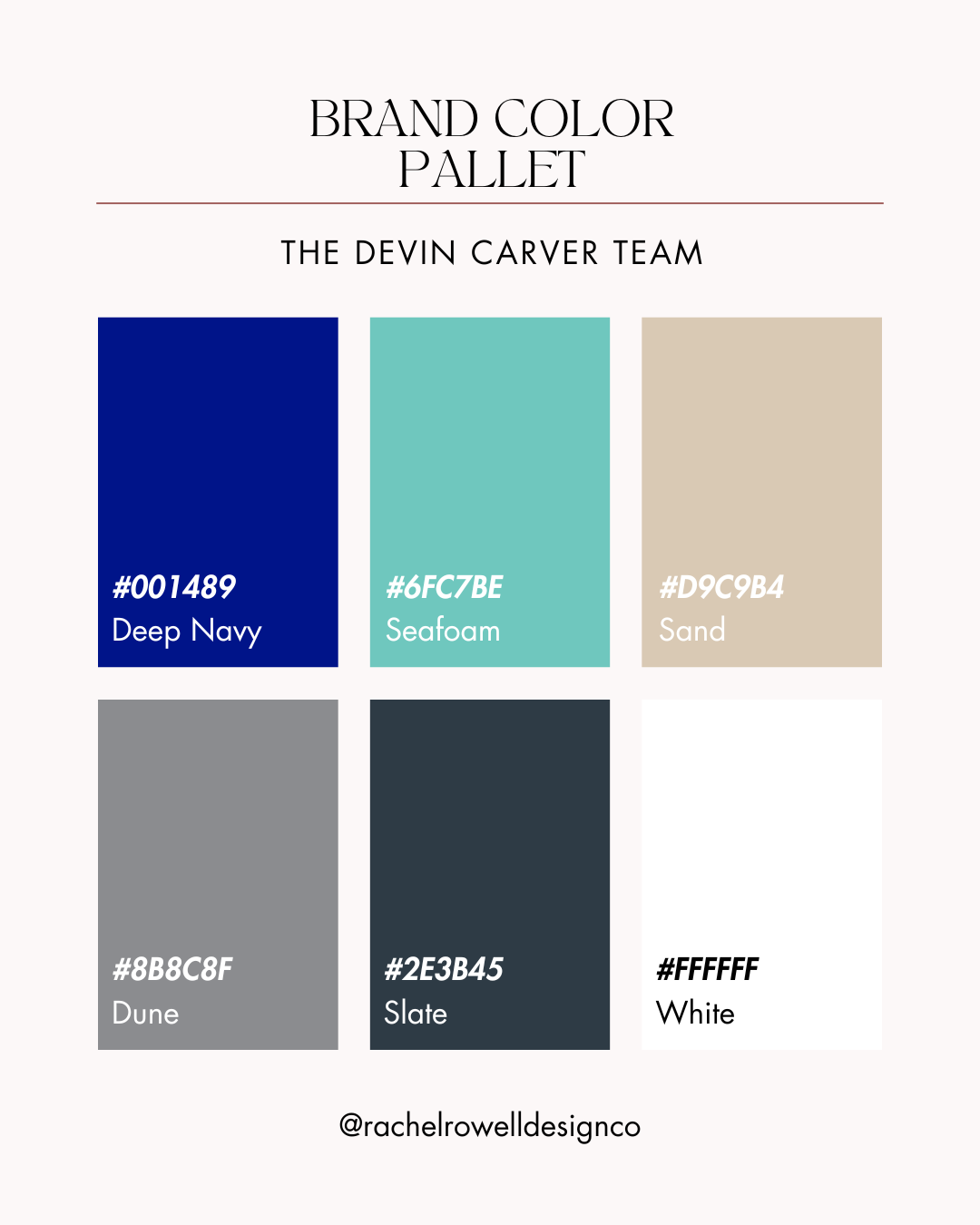
Synopsis of Brand Color Palette:
The Devin Carver Team Brand Color Strategy
Color Palette + Meanings
1. Deep Navy — #001489
Role: Primary brand; headers, buttons, nav
Represents: Trust, depth, Atlantic coast
Why: Premium feel; white-on-navy has excellent contrast for web/signageHex:
#1D2D3AMessage: Authority, trust, and coastal depth.
Says: “You’re in steady hands.” Use for headers/CTAs/nav.
2. Seafoam — #6FC7BE
Role: Accent; icons, badges, links/hover, charts
Represents: Shoreline freshness, approachability
Why: Lifts the navy; use for fills/accents (not body text on white for AA)
Message: Fresh, welcoming, approachable.
Says: “This is doable.” Use for highlights, badges, links.
3. Sand — #D9C9B4
Role: Section backgrounds, cards
Represents: Dunes, warmth, hospitality
Why: Soft contrast that warms the brand; Slate/Navy text remains readable
Message: Warmth, hospitality, sense of place.
Says: “Local and human.” Use for soft section backgrounds/cards.
4. Dune — #8B8C8F
Role: Secondary text, form labels, dividers
Represents: Driftwood, stability
Why: Controls hierarchy without harsh black; great for UI chrome Sand5. Driftwood Taupe
Message: Stability and structure.
Says: “Organized details.” Use for labels, dividers, secondary text.
5. Slate — #2E3B45
Role: Body text, icons, paragraphs
Represents: Bedrock, reliability
Why: Easier to read than pure black; passes WCAG on white and Sand
Message: Clarity and reliability.
Says: “Here’s what matters.” Use for body text/icons.
6. White — #FFFFFF
Role: Core background, negative space
Represents: Clarity, simplicity
Why: Keeps layouts clean and upscale; maximizes contrast with Navy
Message: Simplicity and calm.
Says: “No fluff—clear path.” Use as core background/negative space.*Pairings: White→Navy (CTA), Slate→White (body), Navy→Sand (subheads).
Colors
Deep Navy #001489 (primary) · Seafoam #6FC7BE (accent) · Sand #D9C9B4 (bg/cards) · Dune #8B8C8F (UI/labels) · Slate #2E3B45 (body text) · White #FFFFFF (background)
Typography
Headlines: Cormorant Garamond (or Canela/Noe Display exploration for logo wordmark)
Subheads/UI: Montserrat
Body: Inter
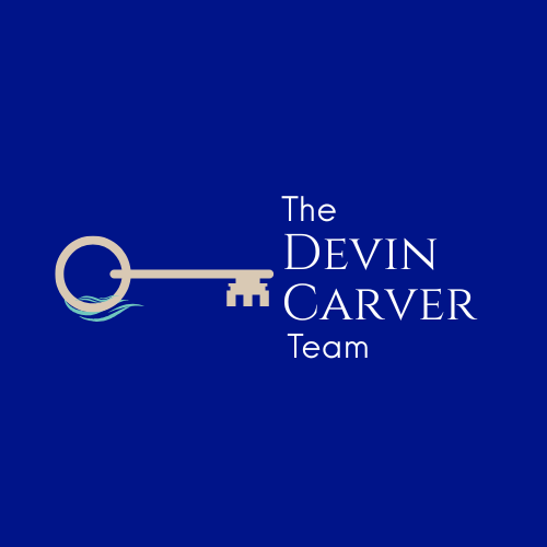
Logo Direction (Round‑2)
Focus: Horizontal key icon (Option 2), no house outline, with Option‑4 type style.
Inside key’s bow: tiny coastal scene variations (no lighthouse):
2A Wave • 2B Horizon (thin line + half sun) • 2C Dunes (with grass tick) • 2D Island silhouette (abstract barrier curve) • 2E Compass ticks (subtle; not dominant).Layouts: primary horizontal; stacked alt for small spaces.
Variants: full‑color navy, black‑only, white‑only. Small‑size simplified icon for favicons/social.
Badges: optional Veteran‑Owned & VA‑Savvy micro‑badge.
Compliance: “brokered by KW Innovate” at 40–60% of name height.
Photography
Bright natural light; human‑forward; dunes/sea grass; maps; keys; low‑key military‑friendly cues (welcome‑home moments, not clichés).
Collateral & Signage
Business card: Deep Navy front with key‑bow scene; back with contact + QR; optional foil.
Email signature: Name | REALTOR® | Veteran‑Owned | phone | email | site | RateMyAgent.
Yard sign (30×24″) + Surfboard concept: high‑contrast navy/white; large phone; QR to listing; veteran badge optional.
Open house directionals: modular arrows/time stickers.
Note cards & envelopes: Sand stock; navy mark; wave‑line flap.
Social avatars: roundel using key‑bow scene.
Website Plan (copy‑forward items)
Hero: choose A/B/C above.
IA: Home · Search Homes · Areas (Surf City, Topsail, N. Topsail, Sneads Ferry) · Buy · Sell · VA Buyers · Invest · Financing · Tools (calculators, market snapshot) · About (veteran‑owned) · Blog · Contact.
Features: MLS search; saved alerts; calculators; VA Buyer Guide; lenders page; blog; lead magnets; newsletter opt‑in; RateMyAgent integration.
SEO Meta Examples
Topsail Island Real Estate | Veteran‑Owned | The Devin Carver Team (KW Innovate)
VA‑Friendly Coastal Homes in Surf City & Sneads Ferry | The Devin Carver Team
Invest on the NC Coast | STR Rules & Island‑Savvy Guidance
Service Area Language (site & collateral)
Primary: Surf City • Topsail Beach • North Topsail • Sneads Ferry
Also serving: Hampstead • Holly Ridge • Jacksonville • Richlands • Onslow & Pender counties
Coverage: Happily serving clients within ~90 minutes of Jacksonville, NC.
Primary Logo
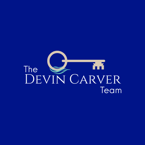
THE DEVIN CARVER TEAM

“The coast is complex—your plan shouldn’t be. I pair Topsail know-how with VA-friendly strategy, answer fast, and lay out clear options—from Surf City to Sneads Ferry—so you can move with confidence.” - Devin Carver
Client Questions to Ponder
Overall Impression/ Specific Feedback on Logo
What was your first feeling/reaction when you saw the mock branding/logo options that you most like?
Does the design feel aligned with your brand’s mission, values, and target audience?
How do you feel about the overall shape, style, and layout of the logo?
(Identify any preferences or concerns related to the structure.)Does the logo represent the personality of your brand (e.g., approachable, professional, innovative)?
(Checks if the logo captures the brand's tone.)Are there any elements of the logo you love or dislike (symbol, font, icon, etc.)?
(Gathers detailed insights about specific design elements.)Do you feel the logo is versatile enough for different applications (website, social media, print, etc.)?
(Ensures functionality across various media.)
Color Palette Feedback
Do the colors resonate with the emotions or tone you want to convey (e.g., calm, energetic, luxurious)?
(Assesses if the color palette communicates the right message.)
Are there any colors in the palette that you love or feel don’t work?
(Helps refine your color scheme.)Do you feel the contrast between the colors works well for readability and visibility?
(Checks practicality of the palette.)
Typography and Font Choices
How do you feel about the font(s) used in the branding/logo?
(Gathers feedback on typography.)
Do you think the font style matches your brand’s voice (e.g., bold, classic, elegant)?
(Ensures typography reflects the brand’s character.)
Additional Elements
Do you feel the branding and logo designs will appeal to your target audience?
(Validates the relevance to your market.)
Are there any elements or design choices that feel off-brand to you? If so, what would you change?
(Encourages suggestions for improvement.)How do you envision this design being used in your marketing materials or digital presence?
(Assesses how well the design fits into your practical applications.)
Next Steps
Is there anything else you'd like to see explored or adjusted in the next iteration?

Devin,
Thanks for the thoughtful notes—super helpful. I’ve updated everything to reflect a Topsail-first identity, veteran-owned/VA-friendly positioning, and the “straightforward advice” voice. Below is your clean review brief plus the new logo directions.
What’s updated
Logo — Round-3 focus (your logo Option 2 refined with a less modern, more vintage key with “coastal water” details that aren’t too fine, and said name font choices.)
Thanks again—here’s the tightened Round-3 logo package based on our call.
Appreciate you, and excited to dial this in. If you’d rather talk it through, happy to hop on a quick call.
— Rachel Rowell
Rachel Rowell Design Co.
rachel@rachelrowelldesignco.com Rachel Rowell
Email: rachel@rachelrowelldesignco.com