

FREEDOM INTEGRATIVE WELLNESS
SERVICE
Full Re-Brand Identity & Custom Website
Welcome to Freedom Integrative Wellness
Empowering Your Health Journey with Root Cause Care
At Freedom Integrative Wellness, we believe in freedom of choice in medical treatment and we understand that true health goes beyond masking symptoms—it’s about uncovering the root cause of your condition and restoring balance to your body. For over 15 years, we’ve been a beacon of hope for individuals and families seeking answers when conventional medicine has left them feeling unheard, misunderstood, or out of options.
"True freedom in healthcare means having the knowledge, personalized options, and compassionate support to choose a path to wellness that’s uniquely yours. At Freedom Integrative Medicine, we empower you with advanced testing, innovative therapies, and tailored care plans to make that choice with confidence."

Comprehensive Brand Identity for Freedom Integrative Wellness
Brand Strategy
Purpose:
To provide a beacon of hope for patients seeking alternatives to conventional medicine by uncovering the root causes of illness and offering personalized, integrative solutions. Freedom Integrative Wellness prioritizes innovation, bio-individuality, and empowering patients with freedom of choice in their healthcare.
Positioning Statement:
Freedom Integrative Wellness is the leading integrative healthcare practice in South Carolina, offering cutting-edge treatments such as EBOO therapy and ozone therapy, alongside functional and holistic primary care. We specialize in addressing the root causes of illness through advanced testing and personalized care plans, giving patients the tools to take control of their health journey.
Unique Value Proposition:
Advanced testing to uncover the root cause of illness.
Personalized care based on bio-individuality—"we test, we don’t guess."
Exclusive therapies like EBOO, available nowhere else in the state.
Compassionate, patient-first approach to empower informed decisions.
Target Audience
Demographics:
Age Range: 30–65 years old.
Income: High-income individuals who can afford premium services.
Location: Primarily North & South Carolina and surrounding areas.
Psychographics:
Individuals or families dissatisfied with conventional healthcare approaches.
Patients with chronic or complex health conditions (e.g., autoimmune diseases, cancer, chronic fatigue).
Health-conscious individuals seeking preventive and holistic solutions.
Parents seeking natural and integrative care for their families.
How This Brand Speaks to Its Audience
Tone:
Professional yet approachable, evoking trust and expertise.
Empathetic and compassionate, offering hope and reassurance.
Optimistic and empowering, focusing on solutions and wellness.
Key Messaging Themes:
Hope: “When conventional medicine hasn’t worked, we provide solutions.”
Empowerment: “Your health, your choice—we equip you with the knowledge to take control.”
Innovation: “Cutting-edge treatments tailored to your unique needs.”
Personalization: “Every body is different. We test, we don’t guess.”
Imagery Style:
Bright, natural lighting with clean and modern aesthetics.
Patient-focused imagery: empathetic care, diagnostic testing, and wellness activities.
Natural elements: water, sunlight, and greenery to emphasize renewal and integrative healing.
Messaging
Tagline Options:
"Your Health, Your Freedom."
"Healing Root Causes, Restoring Lives."
"Personalized Care for a Healthier You."
Key Phrases:
“We test, we don’t guess—because every body is different.”
“Freedom in healthcare starts with informed choices and personalized solutions.”
“Empowering your health journey with integrative care and cutting-edge therapies.”
Call-to-Action Examples:
“Take the first step toward true healing. Schedule your consultation today.”
“Discover the power of bio-individual care—because your health is unique.”
“Transform your health with the only practice in South Carolina offering EBOO therapy.”
Freedom Integrative Wellness’s rebrand positions the practice as the premier provider of advanced, integrative care for high-value patients. By focusing on bio-individuality, root cause treatment, and cutting-edge therapies, the brand appeals to those seeking personalized, effective solutions for their health challenges. The compassionate tone, sophisticated visual identity, and empowering messaging create a strong emotional connection with the target audience, ensuring trust, loyalty, and long-term success.
This identity represents a shift from conventional healthcare to a more patient-centered, innovative approach, embodying the ethos of true freedom in medicine.
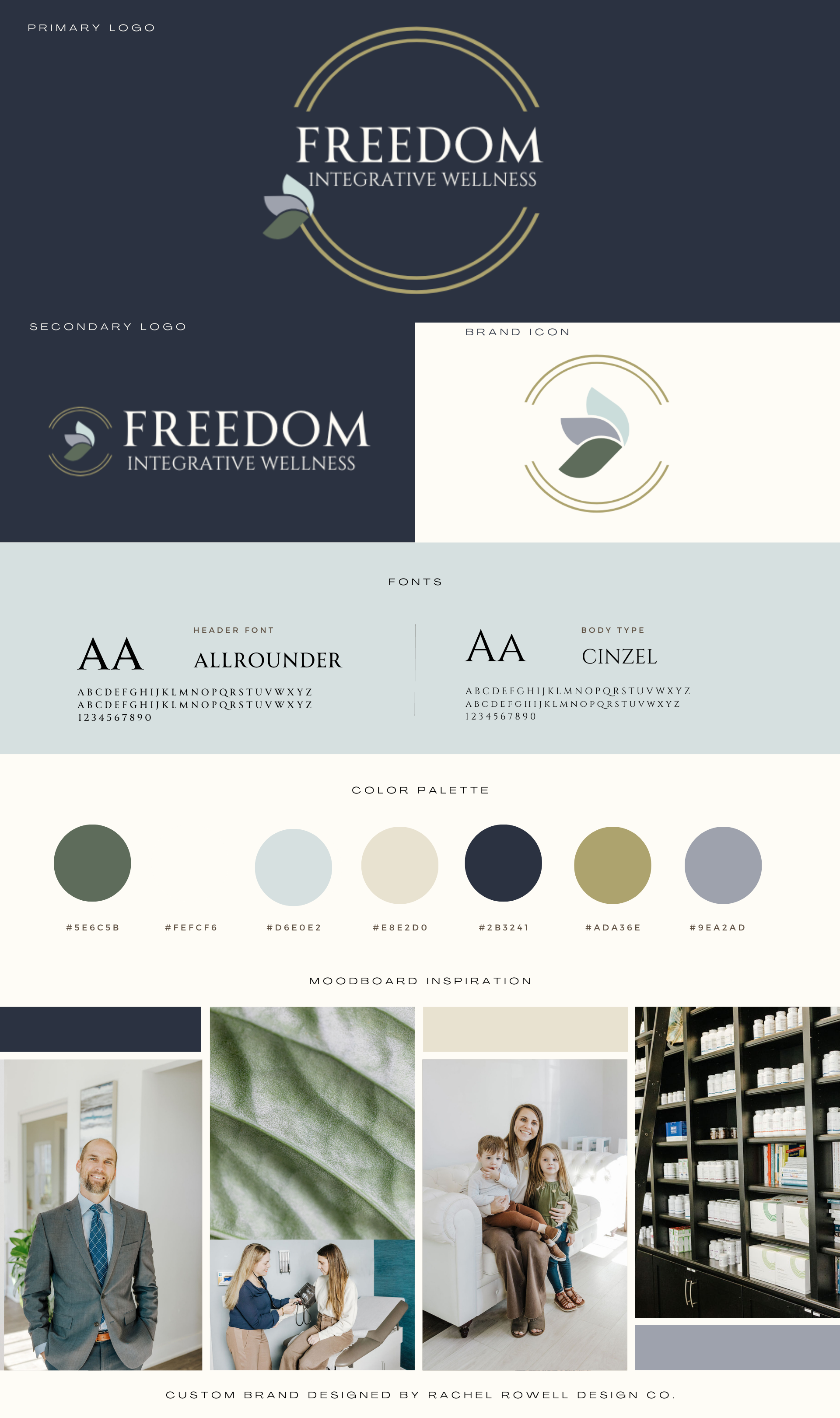
RE-BRAND IDENTITY JOURNEY
RENDITION MERGING of ORIGINAL COLOR PALLETS with Addition of gold accent color.

Synopsis of the Freedom Integrative Wellness Brand Color Palette:
This color palette for Freedom Integrative Wellness effectively communicates a harmonious balance between professionalism, trustworthiness, and a welcoming warmth. Here’s a detailed breakdown:
Core Color Themes:
Forest Green (#5e6c5b):
Reflects a connection to nature, health, and wellness. It conveys grounding and reliability, reinforcing the brand’s focus on integrative care.
Cloud White (#fefcf6):
A clean, neutral base that symbolizes simplicity and purity. It balances the darker and richer tones, giving an open and airy feel.
Sky Blue (#d6e0e2):
Evokes tranquility, clarity, and trust. A calming tone, it aligns with the brand’s mission of creating a stress-free and holistic environment for clients.
Cream Foam (#e8e2d0):
Adds a warm, approachable touch, ensuring the palette feels inviting rather than clinical.
Rich Navy (#2B3241):
Provides a sense of depth and professionalism. It grounds the palette, giving the brand authority and credibility.
Gold (#ada36e):
Adds a touch of sophistication and luxury, symbolizing the value and quality of the services provided by the brand.
Periwinkle (#9ea2ad):
A muted, modern accent that bridges the cooler and warmer tones, enhancing the overall cohesion of the palette.
Overall Brand Messaging:
Trust & Expertise: The combination of forest green, navy, and white projects dependability, knowledge, and trustworthiness—key values for a wellness brand.
Warmth & Approachability: Cream foam and gold provide a welcoming and humanizing touch, ensuring the brand feels accessible to clients.
Calm & Clarity: The soft blues and greens instill a sense of peace and wellness, aligning with the brand's goal of promoting health and balance.
Sophistication & Modernity: The muted tones and thoughtful use of gold highlight the brand’s premium and contemporary positioning.
Practical Application:
Interior Design: This palette would work well in clinic spaces, creating a calming yet professional atmosphere.
Digital Presence: The colors ensure visual consistency across websites, social media, and promotional materials while remaining visually appealing.
Printed Materials: The navy and gold accents can be used for logos, business cards, and brochures to emphasize professionalism and luxury.
The Freedom Integrative Wellness color palette strikes an excellent balance between professionalism, nature-inspired calm, and welcoming warmth, making it a perfect representation of a brand that focuses on holistic and integrative wellness solutions.
PRIMARY LOGO W/ COLOR REVERSE


SECONDARY LOGO


Purpose and Use of Secondary Logos
Purpose: Secondary logos are alternative versions of a brand's primary logo that provide flexibility and adaptability across various mediums and layouts. While maintaining the core elements of the primary logo, secondary logos offer variations in composition, orientation, or design to suit specific applications. They ensure that the brand remains visually cohesive, even when the primary logo is not ideal for the given context.
Key Purposes Include:
Adaptability: Secondary logos are designed to fit spaces or formats where the primary logo may not work, such as horizontal or vertical layouts.
Visual Variety: They add diversity to the brand’s visual identity, preventing repetition and enhancing aesthetic appeal across different touchpoints.
Enhanced Usability: By offering more layout options, secondary logos simplify the design process for various platforms and media.
Brand Cohesion: Secondary logos ensure consistent branding, even when design constraints require adjustments to the primary logo.
Use:
Digital Media: Secondary logos are used in website headers, email banners, or social media posts where a more horizontal or condensed version of the logo may be better suited.
Print Collateral: They appear on brochures, advertisements, or signage where space and layout require variations of the primary logo.
Product Packaging: Secondary logos are ideal for areas where the full primary logo might be too large or distracting, such as small labels or secondary panels.
Event Materials: Useful for branded merchandise like tote bags, lanyards, or event signage, where layout restrictions call for alternative logo formats.
Marketing Campaigns: Secondary logos can bring a fresh yet recognizable look to specific campaigns while maintaining alignment with the overall brand identity.
By providing flexible and complementary design options, secondary logos play a vital role in maintaining a strong and cohesive brand presence across all platforms and applications.
BRAND ICON


Brand Icon Description and Applications
A brand icon is a visual symbol that represents the core identity, values, and personality of a brand. It is designed to be simple, memorable, and instantly recognizable, often incorporating a unique shape, stylized letter, or abstract graphic. The icon conveys the essence of the brand at a glance, making it an essential tool for building a strong and cohesive brand identity.
Typically, a brand icon is designed with a carefully selected color palette that evokes the brand’s emotional and cultural message. Its design ensures versatility, allowing it to adapt seamlessly across various platforms, sizes, and mediums without losing clarity or impact.
Why Use a Brand Icon?
Brand Recognition: An iconic visual element helps audiences quickly identify the brand in a crowded market.
Consistency: It ensures a unified visual presence across all touchpoints, reinforcing the brand’s identity.
Memorability: A well-crafted icon leaves a lasting impression, increasing the likelihood of recall.
Emotional Connection: Colors and shapes evoke emotions, helping establish a deeper connection with the audience.
Where to Use a Brand Icon
Digital Platforms:
Websites and mobile apps.
Social media profiles, posts, and advertisements.
Print Media:
Business cards, letterheads, and envelopes.
Flyers, brochures, and banners.
Product Packaging:
Labels, tags, and boxes.
Embossing or engraving for luxury items.
Merchandise:
Branded apparel, accessories, and promotional items.
Corporate Assets:
Presentations, annual reports, and proposals.
Office signage and branding materials.
How to Use a Brand Icon Effectively
Ensure Scalability: Design the icon to look crisp and clear at any size, from tiny favicons to large-scale billboards.
Maintain Visual Consistency: Use the icon alongside other brand assets (logo, typography, colors) to create a cohesive identity.
Adapt for Context: Consider monochrome, flat, or textured variations to fit different applications while retaining brand integrity.
Prioritize Legibility: Keep the design clean and uncluttered for maximum clarity, even in small or low-resolution formats.
By strategically placing the brand icon across all points of interaction, it becomes a powerful tool for building brand equity, enhancing visibility, and fostering customer loyalty.
FULL BRAND IDENTITY SUITE
-
![Logo for Freedom Integrative Wellness with a circular design and leaf accents.]()
Primary Logo
-
![Logo with text "Freedom Integrative Wellness" in a circle design, featuring leaf graphics, on a dark background.]()
Primary Logo
-
![Freedom Integrative Wellness logo with abstract leaf design]()
Secondary Logo
-
![Freedom Integrative Wellness logo with leaf design on dark background.]()
Secondary Logo
-
![Abstract leaf design with circular gold line accents on a light background.]()
Brand Icon
-
![Abstract geometric logo with circular design on dark background.]()
Brand Icon

CUSTOM BRAND IDENTITY BOARD
FREEDOM INTEGRATIVE WELLNESS
